Segmented predictions.
From a neglected page to the most visited page in the tool.
A page that had been stable for years. Attention that had moved elsewhere. An opportunity that nobody had looked at closely. That's where this started.
Role
Lead Product Designer
Company
GfK
Scope
Full discovery and redesign cycle
Year
2025
Outcomes
Background
The platform helps enterprise clients analyse business performance data across multiple dimensions.
One of its core analytics pages had been quietly left behind for years: outdated design system components, known UX friction, and visual patterns out of sync with the rest of the platform that had continued to evolve around it.
The Challenge
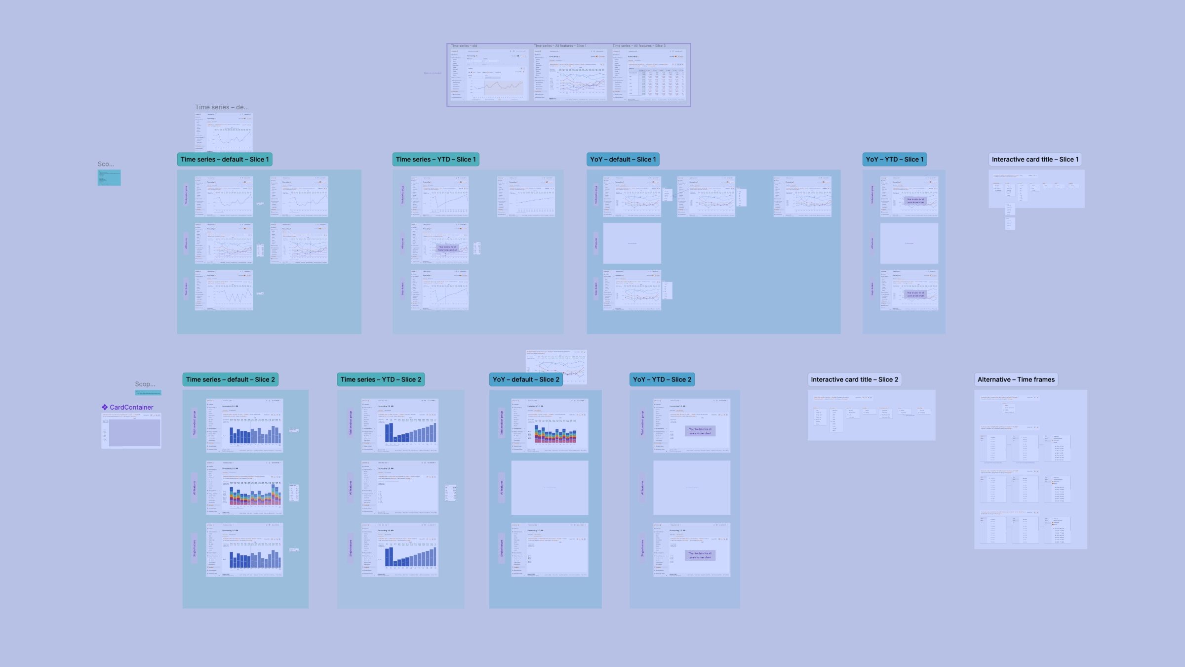
The core user problem was structural. Analysing multiple data segments required selecting and extracting information one at a time, a slow and repetitive process that didn’t match how analysts actually work. Users needed to compare performance across segments simultaneously, not sequentially.
Beyond the interaction model, the page’s data visualisation had drifted from the rest of the platform, adding cognitive load for users who were otherwise fluent in the system.
Building the case for the work
I raised the UX issue with the product leadership and, when the first instinct was to patch it, I reframed the scope: this wasn’t a bug fix. It was a chance to realign the page with the platform’s data visualisation standards and unlock meaningful value for users.
I came to the conversation with a clear problem statement, early evidence, and a path forward. Once the opportunity was visible, the team aligned quickly. We secured the redesign.
Research and Discovery
Before designing anything, I ran structured discovery:
- Client interviews with six users
- Workshops and interviews with internal domain experts who work closely with how users use the product
Prototype testing confirmed the direction immediately. Clients navigated the prototype independently, without prompting or guidance.
And the research produced another finding I had anticipated: A feature that internal colleagues had long treated as crucial, one that had existed since the product launched, went entirely unnoticed by users. When shown it explicitly, they rated it a nice-to-have or said they didn’t need it at all.
I brought the findings back to the product team, and together we decided to cut the feature. This is what rigorous discovery looks like in practice: not validation of what already exists, but the willingness to let evidence reshape the plan.
The Design
Two decisions drove the final solution:
-
Interaction model change. I replaced the sequential flow (select a segment, extract information, repeat) with a parallel side-by-side comparison that lets users analyse all data segments at a glance. This directly solved the core pain of understanding relative performance without a time-consuming extraction loop.
-
Visual consistency. I brought the page’s charts and interaction patterns in line with the rest of the platform, reducing cognitive load and improving coherence across the product.
Results
- Most visited page in the tool within one month of launch, replacing the previous all-time leader
- 13% overall tool usage increase across the platform
- Exceptional recognition from senior leadership
Stakeholder Presentation
The designs were presented at multiple levels, including senior leadership. The response was unusually strong. One senior stakeholder said he had nothing to add, a reaction that, in my experience, is genuinely rare.
Reflection
Most teams treat a “refresh” as a translation exercise: old components to new, same structure, updated visually. But neglected pages are often where the most meaningful improvements are waiting. You only find them if you ask “what can we do fundamentally better?” instead of “how do we update what’s there?” A component refresh gets you incremental improvement. Questioning the interaction model gets you the most visited page in the product.
Post-launch engagement tells the deeper story. The page has shown a sustained upward adoption trend since launch, events-per-user are high, and 20% of users export data from the tool. That’s the clearest signal of genuine utility: not engagement metrics, but evidence that the design is producing something people actually use.
Skills